


This blog was written by Nick Purdy.
Over two years ago, Adidas pitched Gary Bettman and the National Hockey League on a league-wide project to design 31 Reverse Retro jerseys, one for each NHL team. The motivation behind the designs was to create jerseys that honored the history of each franchise while instilling a sense of modern flare to finish the look.
The new NHL Reverse Retro jerseys were unveiled on November 16th 2021, and the designs from top to bottom are all pretty much a bull’s-eye, which makes my job tough here, trying to rank all 31 of them.
While I certainly got this wrong unless you’re a Hurricanes/Whalers fan (tell us why your team’s Reverse Retro jersey is the best in the comments!), I’ve settled on a ranking that looks just like this:
31. New York Islanders

Honouring the New York Islanders dynasty of the early 80s, this jersey pulls the reversal on the 1980 white home jersey, flipping it to a former shade of Islanders’ navy blue. I’ve put it at the bottom though because I believe the Islanders missed on the obvious opportunity to revive the horrendously infamous Fisherman (or “Fishsticks”) logo… They lost even more marks when I realized the navy blue colour they return to here is the colour from that very Fisherman logo they were too afraid to incorporate. And to think that now, after the Reverse Retro jerseys have been released, the Islanders are selling Fisherman-branded gear again in their gift shop! It’s nice, but it could have been way better – and they know it.
30. Detroit Red Wings

I like this jersey. Detroit went uber-simple with their take on the Reverse Retro jersey, and I like that simplicity, showing off one of the coolest logos in the league. This one harks back to the 1998 Red Wings, when captain Steve Yzerman hoisted the franchise’s 9th Stanley Cup. It then weaves in a touch of the team’s NHL Centennial Classic jersey, with the silver stripes on the sleeves and bottom hem. I do think it might have been cooler to add more reversal to the design by flipping the white for the new-look silver.
29. Vegas Golden Knights
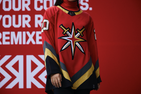
There isn’t much Vegas can do about their Golden Knights being so low, as with only 3 years of history to draw on, there isn’t much to work with. That said, they made a fantastic effort, gathering the history of hockey in the Vegas area by paying homage to the Las Vegas Thunder IHL team of 1993-99, incorporating that franchise’s “V” striping on the bottom and sleeves of the jersey. Of course, the logo is the Golden Knights’ alternate, which has never before been featured as the crest on their jersey. That’s more than enough for me to want to rock this jersey on the strip.
28. Dallas Stars

The Reverse Retro jersey from the Dallas Stars makes a nice splash. It stands out for its uniqueness. The star logo appears to radiate outwards with the bold star-shaped stripe that moves across the sleeves and front of the jersey. It makes us think of odd, star-shaped rings around Saturn. I’m not sure whether that is a physical possibility, but it definitely got me thinking about the stars! The jersey reverses the 1999 Stanley Cup winning team’s road jerseys by turning it white (originally green) and then utilizing the club’s new colour scheme. Yeah, you’ll have no problem shining like star in this one.
27. Toronto Maple Leafs

Big and bold, and not messing about – that’s how I view the Reverse Retro jersey from the Toronto Maple Leafs. We’re heading back to 1967 (yes, that year) for this jersey, the first year the Leafs introduced the 11-point maple leaf logo. The reversal to the jersey is shocking us with the grey. The solid grey piping across the top and balanced nicely along the bottom of the jersey with a thick, grey stripe reminds us of the jersey style of the 70s, but with more attitude. The thick, grey outline of the logo does a similar job to the piping of giving an overall look of toughness and strength. I think it’s pretty badass and maybe it’ll be the good luck charm the Leafs need to reverse their playoff luck.
26. Edmonton Oilers

Hello Gretzky! Yes – the Edmonton Oilers aren’t going to mess this one up. No, their Reverse Retro jersey celebrates the debut of the Great One in 1979, and why shouldn’t it?! Spinning in a reversal of the numbers by flipping them to orange for the first time – along with the first orange yoke on the shoulders! – brings this jersey right into modern quite seamlessly. On the other hand, the thin stripes on the sleeves and bottom of the jersey preserve the classic feel. This looks good on any age group.
25. St. Louis Blues

And why not stick with the Great One? If you can, you very well may – and St. Louis wasn’t shy to return to their 1995 jerseys that the franchise wore through the late 90s, including when Gretzky (and Brendan Shanahan and Brett Hull and Chris Pronger) lead the team. Back then the jersey was a lot bluer. For their Reverse Retro jersey, St. Louis flipped the red for the blue, allowing the 90s iteration of the blue note logo to pop more against its new red background. Extra points for bringing back the trumpet logo on the shoulder.
24. Washington Capitals

Flying back to 1997, the Washington Capitals brought back their Screaming Eagle logo for their Reverse Retro jerseys. Originally set against a teal backdrop, the Reverse Retro version drops in the Captals’ red to bring the look into 2020. The jersey also features a return to an old font for the lettering and the Dome logo on the shoulder, originally introduced in ’97. All I know is that, against the red, you’ve gotta love that eagle. This was one of the hottest jerseys of the whole pack and sold out almost instantly on Cool Hockey.
23. Tampa Bay Lightning

The Tampa Bay Lightning’s Reverse Retro jersey brings back the 2004 jersey the team wore when they won their first Stanley Cup. We get a return to the franchise’s original logo, which looks as fresh as it did in 1992. This gives the original a serious update though by reversing the colours and making the vibrant, royal blue the main attraction. The move away from the black jerseys brings colour and life to a jersey that is already charged with electricity. The Stanley Cup champs are going to look great in this item when they hit the ice in 2021.
22. Pittsburgh Penguins

When they said “Reverse Retro,” we were expecting to visit history, but I wasn’t expecting to be launched back into hip hop history. I am more than grateful though to the Pittsburgh Penguins for giving us another great reason to crank Snoop Dogg’s “Gin ‘N Juice.” This Penguins jersey is as much a shoutout to Snoop in the video for his song as it is to Mario Lemieux capturing his 6th scoring title in 1997 – or to Jaromir Jagr’s mullet (RIP 1999). Either way, this simple, clean look is classic and sharp – especially with the original penguin on the shoulder. This is a jersey that’s going to age very well.
21. Philadelphia Flyers

I really like the way the Philadelphia Flyers’ Reverse Retro jersey takes the 1995 version, and then reverses the white for black. It creates a football player-like imposing presence on the wearer that screams “perfect” for the franchise formerly known as the “Broad Street Bullies.” The Broad Street Bullies are officially the version of the team from 1972-80, but the football look works just as well for the ’95 team, headlined by a line dubbed the “Legion of Doom.” I’d say that makes this jersey banging.
20. Columbus Blue Jackets

The Columbus Blue Jackets take us back to their inaugural season in 2000 for their Reverse Retro jersey – and I love it! Flipping the blue for red, making this the first Blue Jackets jersey in with red as the dominate colour, works wonderfully. The white piping across the sleeves and shoulders is capped by a blue ring with white stars, providing a sleek accent. And to really complete this jersey properly, Columbus hooked us up with the cannon logo on the shoulders – boom!
19. Calgary Flames

“Blasty” is back! I know there is an entire generation of Flames fans who adore the flaming horse logo, affectionately named Blasty. Designed to honour the Calgary Stampede and Calgary’s Western culture, Blasty was there for when Jarome Iginla won the Art Ross and Rocket Richard trophies in 2002. First arriving in 1998, the logo graced the front of Flames jerseys until 2003. There’s an entire Red Mile just waiting to breathe fire with these.
18. Boston Bruins

When you’re an Original Six franchise, you already own an incredible jersey. The Boston Bruins weren’t about to mess around with a good thing, reaching back to the years of Cam Neely and Ray Bourque in 1988 and ’90 for their Reverse retro jersey. The original is flipped to yellow, and any Bruins jersey in golden-yellow is always a treat. Top marks for including the classic bear crest on the shoulder.
17. Nashville Predators

Back in 1998, when the Nashville Predators first entered the NHL, they arrived on the scene in navy jerseys that looked very much like these. Going full mustard yellow with their Reverse Retro jerseys is exactly what the veterinarian ordered. The textured silver sleeve twists a sense of contemporary flare to the design, while also creating a silver fang-like shape on the sleeve. This is a smooth and dangerous look for the Predators.
16. San Jose Sharks

What do you do when you already have a jersey with the trendiest colour scheme and sweetest logo? First, know what is what. You just resigned Patrick Marleau who is nearing the end of his career – why not bring back the jersey he first wore with the club when he entered the league in 1998? Next, reverse the colours of that jersey: flip the black with the teal and the white with the grey. And finally, do nothing else – your branding is already on fire!
15. Florida Panthers

I really like the throwback the Florida Panthers have given us with their Reverse Retro jersey. This goes back to their inaugural season in 1993, and the same look the team rolled all the way to Stanley Cup finals in in their third season. The reversal of red into dark blue was in fact first accomplished in an alternate jersey worn in 1998, and it looks fantastic with the leaping panther popping off of it. A really nice touch that brings this into 2020 was trading the original yellow for a stronger gold. These are about as ferocious as they could be.
14. Buffalo Sabres

Yes, yes, yes! The Buffalo Sabres take us back to 2000 with their Reverse Retro jersey. Originally, this was an alternate jersey that today receives a reversal from its red and black colour scheme to the current blue and yellow. “Buffalo” proudly stretches across the lower trim of the jersey, highlighted by the vibrant yellow-gold stripes. Updated like this, the jersey is a stunning look, with the charging buffalo logo adding icing to the cake on the shoulder. Only one word can describe these appropriately: sharp.
13. Anaheim Ducks

Thank the lord! The Ducks didn’t – like the Islanders – shy away from their cartoony past: they went Mighty. Reaching back to 1995, the Ducks revived their “Breakout” jersey, featuring “Wild Wing” breaking through a sheet of ice. This is the only Reverse retro jersey that uses a sublimated logo (one printed directly on the fabric). They’ve reversed the colours, with the white playing the dominate role, and brought back the wacky font. There isn’t a jersey anywhere more animated than this one, and I wouldn’t have had it any other way.
12. Arizona Coyotes

The hits definitely continue with the Arizona Coyotes’ Reverse Retro jersey. Back in 1999 and up to 2003, the Coyotes rocked a third, green jersey, featuring a Peyote Coyote head. Similar to the Wild Wing above, the Peyote Coyote was a notorious design. Their Reverse Retro jersey brings that back, trading the green base for a vibrant purple that allows the coyote head to leap off the jersey. The stylized desert landscape that hugs the bottom of the jersey works perfectly with the purple, and the gecko on the shoulder patch is a cool touch. This is fun and versatile.
11. New Jersey Devils

We’ve seen some great colour reversals so far, but the New Jersey Devils Reverse Retro jersey immediately catches your eye. It’s the return of green to New Jersey, and the timing of this couldn’t be better with Christmas just around the corner. While this harks back to their original jerseys in 1982, this is the first to feature green as the primary colour, only ever featured as stripes and accents. This is a true reversal, and it really makes us salivate.
10. Ottawa Senators

It’s definitely red. And I love it that way! The Ottawa Senators Reverse Retro jersey is a throwback to the franchise’s inaugural season in 1992, featuring their noted “2D” logo, which clearly stands the test of time. It’s a logo that screams, “I’m ready for battle!” The red, black, and gold colour scheme is plainly hot. The simplicity of the jersey design itself allows those colours to do what they need to do: look cool as hell.
9. Winnipeg Jets

The Winnipeg Jets’ Reverse Retro jersey is the type of throwback I like to see. It takes the original 1979 iconic heritage plane crest and remixes it with the current Jets’ colour scheme. Trading the old burgundy red of the plane crest and “Winnipeg” lettering for the new ice blue gives the overall logo a needed refresher. The grey primary colour is a base made for battle. The colours are just so smooth on this jersey, I really can’t say no.
8. New York Rangers

It has been 24 years since Lady Liberty graced the front of the New York Rangers’ jersey, and I couldn’t be happier to see her back. The Rangers went with a more vibrant blue and deeper red colour than previous, and added a subtle silver to replace what was white. Besides the strong Lady Liberty logo design, the jersey is a victory because it also disposes of the flashy red sleeves former iterations showcased. This updated look is simple and really more eye-catching and classy because of it. Heck this jersey even made GQ’s “List of the top menswear items to buy this week”.
7. Chicago Blackhawks

The history of the Original 6 franchises goes deep, and the Chicago Blackhawks Reverse Retro takes us back farther than any of the other Reverse Retro jerseys. Here, we get an update on the secondary jersey the Blackhawks wore during 1937-55, when they weren’t sporting the classic barber pole-striped jerseys they were known for. Instead of the original white base, the Blackhawks logo rests on top of a black background in this Reverse Retro update. The look is sturdy, crisp, and sure to be a hit with both traditionalists and hipsters.
6. Vancouver Canucks

I love this Reverse Retro jersey. It takes what was really not a very pretty jersey – the 2001 Canucks jersey with odd blue-to-red gradient – slaps the new Canucks blue-green colour scheme on top, and presto, we got ourselves an absolute beauty of a jersey! Blue-to-green will always work more smoothly than blue-to-red, and if anyone wants to contest that, please just take a look at these Vancouver jerseys. This is also the only jersey that employs a gradient: the fact that the updated Reverse Retro jersey’s gradient works beautifully means that this jersey definitely receives extra points for originality.
5. Los Angeles Kings

The Los Angeles Kings were a dynasty not too long ago, but, 20 years prior, hockey wasn’t doing much in California. It wasn’t until a certain Wayne Gretzky was traded south that the area began to show serious interest in the sport. To honor that history, the Kings’ Reverse Retro jersey is inspired by the 1989 Kings jersey, the year Gretzky became the NHL’s all-time leading scorer. And of course you can’t be an LA sports fan without an affinity to purple and gold. This jersey is a sweet package that, much like a king, cannot be ignored on the streets.
4. Montreal Canadiens

Wow. Like wow. Who would have thought that simply flipping the 1977 Stanley Cup winning jersey onto a blue base would have such an incredible effect? Not us. The Canadiens jersey is a classic and has always stood the test of time. The changes it has gone through have usually been subtle, and that’s because there’s never been a reason to drastically alter or even experiment with such an awesome jersey. The Reverse Retro jersey cleverly changes nothing while changing it entirely. One colour. Boom. I’ll say it again: wow.
3. Colorado Avalanche

On the ice, and off it, it seems, the Quebec Nordiques and Montreal Canadiens are rivals, arguably the greatest rivalry in the history of the game. And in the battle of the Reverse Retro jerseys, the Colorado Avalanche’s throwback to their original home in Quebec edges out their (former) provincial rival. Taking the Avalanche colour scheme and placing it onto the Nordiques’ design has a chilling effect, with the deep burgundy colour and pale baby blue settling cozily into the icy-white background. And if the colour change wasn’t enough, the fleaur-de-lis design across the hem is an excellent update that certainly brings the jersey into the 21st century while honoring the history of the franchise.
2. Minnesota Wild

I had to pause when I first saw the Reverse Retro jersey for the Minnesota Wild. It’s stunning. I was expecting more of a North Stars throwback, but instead they gave us, well, a North Stars throwback that I didn’t see coming at all. According to the design team, the decision to have the Wild play homage to the North Stars was the easiest decision in the entire Reverse Retro project (yes, I saw that coming). The Wild’s usual jersey design is sometimes criticized for having too many colours, but the Reverse Retro look avoids that by taking the North Stars’ green-yellow-white combination for a much cleaner design. The colours are fantastic, and the striping pattern on the sleeves provides an additional subtle nod to classic North Stars’ jerseys. To be perfectly honest, I kind of wish the Wild would just make this their permanent jersey.
1. Carolina Hurricanes

When it’s all said and done, it really shouldn’t be a surprise as to who the number one Reverse Retro jersey belongs to – we told you at the top! In all seriousness though, the 1979 Hartford Whalers, the franchise’s inaugural season, introduced the world’s greatest logo design ever. The diving whale into the ‘W,’ creating the ‘H’ in the negative space is a feat of stylish brilliance. The emerald green and royal blue colours are slick, and pop nicely against the grey background – the grey colour chosen, as opposed to classic green, because it is the only colour shared by the both the Whalers and Hurricanes. When Adidas aimed for both history and modern aesthetics in the Reverse Retro jersey project, the Carolina Hurricane’s Hartford Whalers throwback is truly the pinnacle of the series.
Unless you’re cheering for ‘the bunch of jerks,’ you’re likely disagreeing with this list, but that’s ok – you don’t need to agree! Find your team’s Reverse Retro jersey here.

